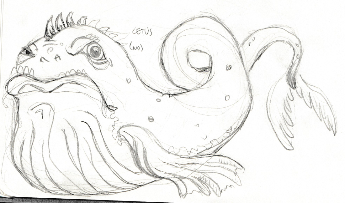
With 36 unique star patterns included in the upcoming game Constellations, I've had to come up with a way to streamline my illustration process. Creating a glowing, monochromatic design is something I had never approached before in my drawings, and it's something I foolishly believed would be like any other drawing. But without color to help break up the image, each figure is defined solely based on shading and linework. This forced met o come up with some unique designs that rely heavily on the silhouette (a word I still have trouble spelling and always will) of the subject.

Who's that Constellation??
An instantly recognizable silhouette helps me get away with keeping the detail work limited to one color. Bearing in mind the final artwork will be printed on 3 1/2 inch cards meant to be viewed from a table's distance away, it's vital to communicate as much to the viewer as possible at a glance!
(It's Cetus!)
After a bit of reworking to fit the design into a square orientation for the card, I'm able to finalize my linework and start adding the shading.

Places on the drawings where I would normally use color to break up the character, I had to rely on shading and value shifts to get the point across. For instance, where Cetus's top and underbelly meet, I would normally use a color shift from a light greyish-yellow to a deep blue-black. For Constellations, I approached this color shift by always shading one side of the linework more than the other. This gives the edges dimension and weight when they would otherwise feel empty.
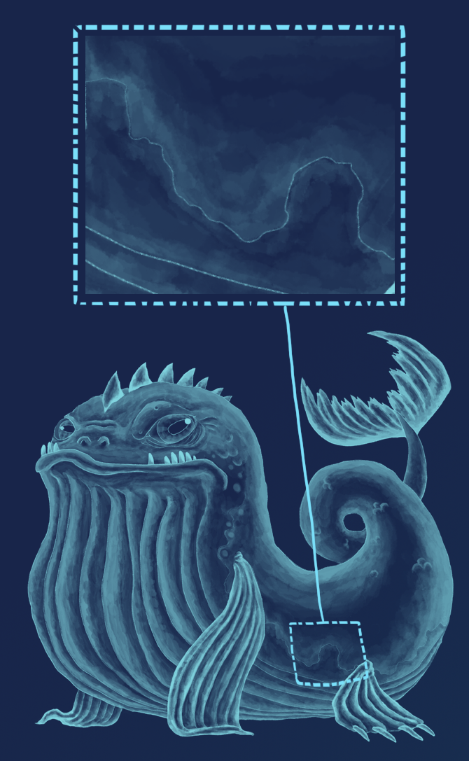
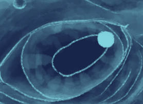 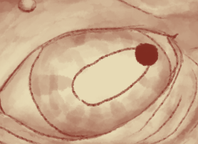 | Another challenge in developing the artwork for Constellations are the eyes. Being that the constellations should appear to be glowing in the night sky, the color I'm adding is actually the light, not the shadow. This is a huge departure in the way I normally work. Usually when you work with pencil on paper, you're shading in the darkest parts of the image, and leaving the brightest parts of the image the color of the paper. This is the opposite. This means that when drawing the eyes, my instinct was to go in and lay the most color down on the pupil( the darkest part of the eye) and leave the color of the background for the glint of light bouncing off the eye. But when using inverted shades, this makes the eye appear to be blind! |
If you want to see the entire process of shading in Cetus from sketch to final, you can check out the process video here:


 RSS Feed
